
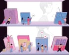
Illustration: Giacomo Gambineri/The Guardian View image in fullscreen Illustration: Giacomo Gambineri/The Guardian Publishing How to make a bestseller: insiders reveal the tricks of the book trade From cover design to shelf placement and influencer partnerships … how publishers will persuade you to buy their books this autumn
Think about the last book you bought. How did you choose it? Was it from a recommendation, a review, a TikTok video? Did the cover grab you, were you swayed by the quotes on the front, or did you just happen to spot it on an appealing table as you walked into the shop? Did you think about all the nudges that led you to that decision – by the publisher, the bookseller or that person you follow on Insta?
The reality is that our reading choices are directed and massaged at every turn. “It’s all about the art of persuasion,” says Philip Gwyn Jones, who was a publisher for more than 30 years and is now a literary agent. And who are the persuaders? They’re the booksellers, the supermarket stock buyers, the publishing houses and their ranks of marketers and publicists. And, more recently, persuasion often comes from BookTokers and online influencers, social media videos, podcasts and Instagram posts. How is all this changing publishing?
We all judge books to some extent by their covers, but did you know how much thought goes into finding just the right cover, colour, font and design? These covers are focus-grouped, shown to supermarket buyers and often changed at their behest, according to Jamie Keenan, one of Britain’s leading book designers. “That happens quite a lot,” he says. “If Tesco with commercial books, or Waterstones with literary stuff, don’t like it, they’ve got a tremendous amount of clout.” (Waterstones and Tesco declined to speak to me for this piece.)
Meanwhile, online browsing and buying have brought about big changes. “There’s been a move towards more iconic book covers because of thumbnail images [on apps and websites],” Keenan explains. “One very simple emblem or logo that you can see from a distance, even when it’s two inches tall. Nice bright colours and big type,” he adds. “That’s what publishers are doing to attract people’s attention.”
It’s true: when I went into Waterstones last week, I felt like reaching for my sunglasses to shield the glare of garish, saturated colours screaming from the fiction shelves: more sweet shop than book store. When I shared a photo on Instagram, a number of authors messaged me. “I hate it,” said one (whose own latest novel has a brightly coloured cover). “It’s just so brash.” Yet ironically, because all these books look the same, the effect is to make them blend in, not stand out. “Jewel tones have the industry in a headlock,” messaged another.
And then there are the increasing numbers of copycat covers, so that every cosy crime novel suddenly looks like Richard Osman’s bestsellers – cream background, coloured border, hand-lettering – and all heartwarming Japanese books have to feature a cat. (At his last publishing house, says Gwyn Jones, for Japanese fiction “there was this unspoken imperative to put a cat on the cover even if there wasn’t a major role for a cat in the book. It did seem to make a difference.”) “You quite often get briefs on what are called comparable titles,” Keenan says. “That’s a nod-and-a-wink way of saying, ‘Can you do something that looks a bit like these three?’”
View image in fullscreen Illustration: Giacomo Gambineri/The Guardian Afte…