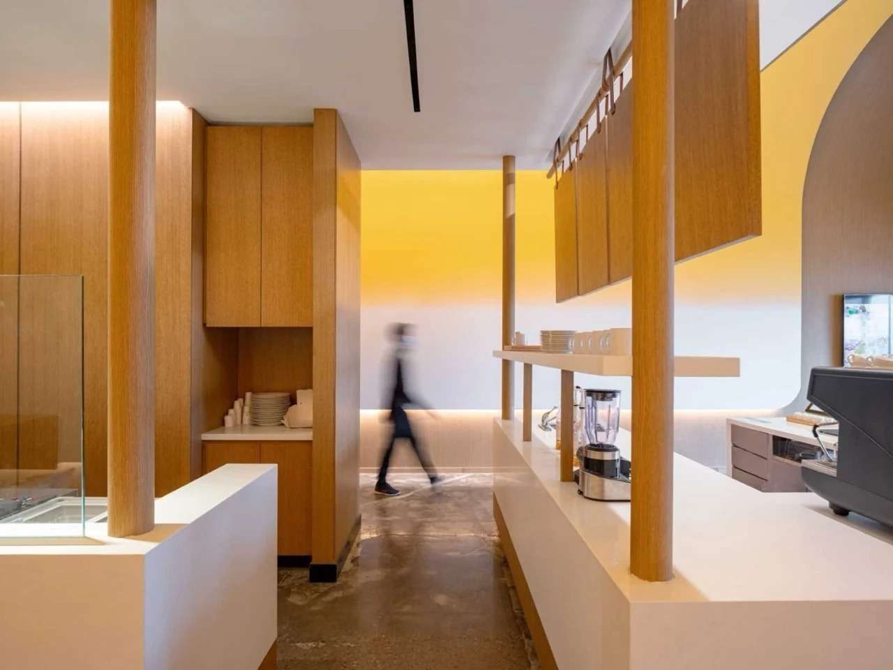
June 30, 2026 June 30, 2026 Home » Design » Interior Design » The design of the 'Fou Fou Gold Square' employs reduction to create a clear spatial experience Dialogue of mass and light: creating a sensory experience through color and curvature, the spatial identity of the project is based on employing studied color and shape as essential tools in shaping spatial experience. The ceiling bends with soft lines immersed in a glossy yellow layer that gradually fades to light cream shades on the walls, in a visual treatment inspired by the product's characteristics without resorting to direct mimicry or literal symbolism. Instead of merely providing an aesthetic background for the space, this gradient transforms into an organizing element that directs visual perception and gives the space a unified and easily readable character.
The vertical distribution of colors enhances the feeling of stability and balance within the café, while the curved surfaces and absence of sharp angles contribute to establishing a visual impression suggesting fluidity and continuity. As a result, architectural elements appear as part of one continuous movement, where color, mass, and light intertwine to form a homogeneous spatial scene that links the brand identity with the daily user experience.
The strength of the project lies in its ability to translate elements of visual identity into an integrated architectural system extending from product details to the internal composition of the space. The color gradients and soft lines do not appear as separate decorative elements but as part of a unified design language that connects different levels of the project. This consistency contributes to building a clear spatial identity, allowing the visitor to read the café's basic idea through the space itself without the need for direct promotional means or additional interpretive signs.
The café's organization is not limited to the distribution of seating and services but relies on creating two different usage patterns within one space. The first side is dedicated to a fast-paced character through tables and seats facing the service area, allowing for a follow-up on the product preparation process and enhancing the vitality of movement. The other side relies on seats integrated within a wooden-clad recess, providing a quieter and more private environment for longer stays.
Lighting supports this functional division by hiding its sources behind signs and architectural elements, ensuring a soft and homogeneous light presence free from visual distractions. The concrete floors and oak woods contribute to achieving a material balance that limits the dominance of color treatment, maintaining clarity and sobriety in the space.
The architectural value of the project lies in its ability to achieve a clear visual and experiential impact using a limited number of elements. By employing a simple color gradient and studied curves and clear functional organization, the design succeeded in creating a cohesive environment that expresses the identity of the place without excessive formalism or visual complexity. This approach emphasizes that the strength of architecture is not always linked to the abundance of elements but its ability to transform a simple idea into a cohesive and convincing spatial experience.
The project transforms the brand's visual identity into an integrated spatial structure, by treating color, curvature, and light as organizational tools rather than merely decorative elements. The color gradient from yellow to cream reshapes visual perception, while the connected surfaces reduce visual friction and unify movement paths. Thus, it presents a model for how design can be employed to integrate brand identity, spatial guidance, and sensory atmospheres within a single architectural language, minimizing the need for direct interpretive signs.
However, the project may entail an implicit assumption that sensory harmony equals architectural depth. Centering the experience around a cohesive visual narrative may limit the plurality of readings and spatial discovery possibilities. The heavy reliance on color continuity and soft geometry raises a broader question within architecture: do immersive environments driven by brand identity expand the role of architecture, or do they reproduce marketing effects through more precise and refined spatial means?