
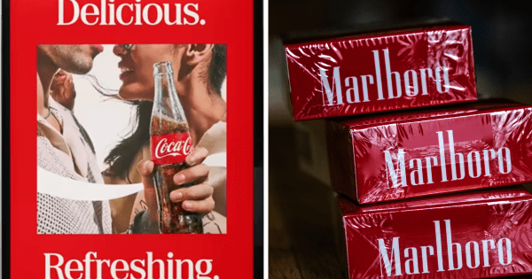
Coke's serif font Better With—used in "Delicious" and "Refreshing," above—got too close to Marlboro's own, especially rendered in red and white. By Robert Klara --> The future of brands gets decided here. Join the industry’s top marketers at Brandweek for the ideas, insights, and connections shaping what’s next. Get your ticket.
Earlier this week, Coca-Cola started an uproar over something consumers usually don’t get worked up about: a typeface.
As part of the launch of a “new global visual identity system,” developed by JKR, Coke tweaked its famous Spencerian script and the “dynamic ribbon” that flows beneath it.
But what got consumers mad was a new complementary slab serif font called Better With. Maybe it should’ve been called better without, since disgruntled masses fumed that the font—used with Coke’s signature red and white colors—looked a lot like a pack of Marlboro reds.
“Am I the only one seeing Marlboro soda?” asked one commentator on X. “Coca-Cola using the Marlboro font in their new rebrand. Very odd,” posted another. “Any person over 40 realizes that this is the Marlboro font,” added a third.
For the record, it’s not. Marlboro uses a proprietary typeface (its nearest equivalent is Neo Contact ) and there are various structural differences between it and Better With. But no matter: the two felt close enough to stir people up.
Coca-Cola did not respond to a request for comment, and a JKR rep referred ADWEEK’s inquiry to Coca-Cola.
At first blush, it looked like the tumult stemmed from high-sugar sodas becoming a Gen Z stand-in for tobacco—“fridge cigs.” That one not-so-good-for-you brand would resemble another terrible-for-you brand was absurd.
Experts suggest that something deeper is going on here that has little to do with smoking or sipping and everything to do with consumers’ psychological bonds to their favorite brands.
“With Coke, the font became the focus because it’s a key identifier of a brand that’s been a part of our lives for generations,” said Sabrina Babooram, partner and head of strategy at Toronto-based agency Academy.
“Coke is wallpaper in people’s lives. Change the wallpaper even a little, and people notice,” added brand strategy expert Allen Adamson, cofounder of Metaforce.
Adamson (who cut his teeth at Landor, which handled Coke’s brand in the 1980s) pointed out that the Better With typeface actually debuted in 2023, when Coke used it briefly for its holiday marketing—“and nobody blinked,” he said.
Customers raising hell over a change in trade dress has happened before. Ikea fans went ballistic in 2009 when the company abandoned its Futura typeface for Veranda; when Tropicana changed its carton (and typeface) that same year; and when Gap switched to Helvetica in 2010—before hastily switching back .
More recently, Jaguar’s inflammatory 2024 rebrand —which included an abandonment of its long-used Optima typeface—prompted British politician Nigel Farage to call the overhaul “commercial suicide.”
These lessons—and Coke’s current enterprise—suggest that while brands probably can’t avoid pushback to updates to their visual identities, it pays to be mindful of how psychologically invested, even possessive, many consumers are of the brands they like.
“Whether they consciously notice them or not, well-known brands have an amazing ability to trigger memories and emotional responses,” said Jon Arriaza, creative director of Chase Design Group. “With brands that own a very strong brand…